- Logiaweb Weekly
- Posts
- Google’s vibe coding just killed mockups
Google’s vibe coding just killed mockups
Natural language prototyping, AI portfolio builders that actually work, and how to go from brief to wireframe in 5 minutes flat
Adrien Ninet
November 03, 2025

Happy Monday, creative family, and welcome to Logiaweb Weekly.
This week’s design intelligence briefing reveals:
🧪 What I'm Building: Behind the Scenes
🚨 Big News: Google's vibe coding revolution for designers
🤖 Design Inspiration: AI portfolio builders that actually work
🛠️ Tutorial of the Week: Brief to wireframe in just 5 minutes with Miro
💡 Prompt of the Week: 3D Minimalist Retro Style
🧪 What I'm Building: Behind the Scenes
This week has been packed with exciting AI news: from NEO, the first robot designed to handle daily tasks at home, to Google’s latest wave of AI tools. The industry keeps accelerating, and it feels like we’re just getting started.
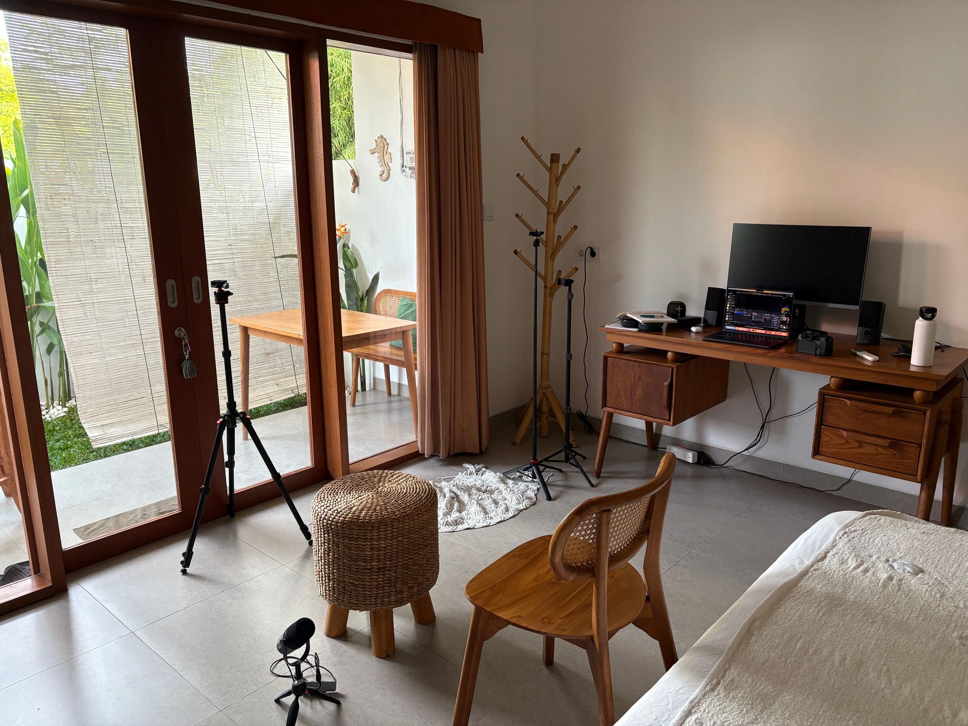
On my side, my focus has been split between building the studio and keeping a steady rhythm of content creation. Days are intense, but I genuinely love it. I still remember when I had no idea what to work on next… and that uncertainty felt way worse than being busy.
Oh, and something big is coming: we're launching a new YouTube channel for the studio, starting with an 8-episode series packed with value. Can’t wait to share more next week.
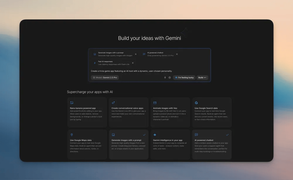
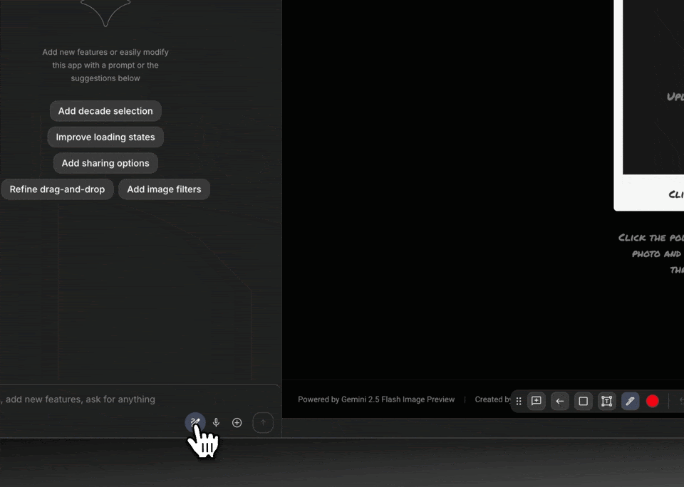
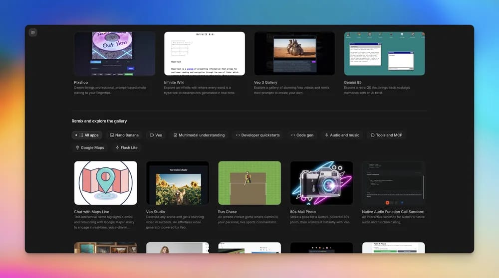
Google just dropped a new vibe coding feature in AI Studio that's shifting how designers create. And honestly? It feels like something we actually needed.
What caught my attention:
Instead of writing precise instructions or code, you just describe the vibe you want and boom Google's AI turns it into a working app.
The best comparison would be Nano Banana or video creation with VEO 3, but for entire applications. Just describe what you're going for and watch it come to life.
If you think visually and want to prototype fast, this changes everything.
Why it matters
Google gave us natural language that actually works. You can say "make it feel premium" or "add a glassy effect," and it interprets the aesthetic intent behind your words.
No more fighting with syntax when you just want to see your idea come to life.
The real win
Most of us are juggling Figma, Notion, and ChatGPT just to bridge the gap between concept and code. With vibe coding, you stay in one creative flow tweaking and testing without the annoying context switching.
Google isn't just making AI smarter. They're making it more intuitive for how us designers actually work.
This could be the tool that finally makes prototyping feel less like translation and more like actual creative work.
If you're constantly jumping between design thinking and technical execution, Google's vibe coding might just be your new secret weapon.
🤖 Design Inspiration: Build your portfolio in minutes, not days
Tool Used: Trickle AI Portfolio Generator
Create a warm, modern portfolio for Emily Carter, Full Stack Developer and UX/UI Designer, using Trickle.so portfolio generator. Use dark brown and orange tones, clean typography, and strong hierarchy. Hero section: gradient background from dark brown (#1B1B1B) to warm orange (#F07B1F), portrait on the right with soft lighting, large centered text “I’m Emily, a Full Stack Developer & UX/UI Designer,” short paragraph “From UX strategy to full-stack development, I create engaging, high-performing digital products,” and two buttons: “Get Started” (solid orange) and “Book a Call” (outline white). Top nav: logo “Emily” left, menu (Home, About, Services, Projects, Contact), rightmost button “Book a Call” (orange). Below hero: thin divider bar listing design principles (Usable, Reliable, Interactive, Clarity, Consistency) in small uppercase with light animation. Services section: title “Innovative Solutions in Design and Development,” subtext “Transforming ideas into meaningful digital experiences that inspire and perform,” button “View All Services.” Three service cards in row (Website Design, Application Design, Custom Development) with dark gray backgrounds, orange icons, and “Learn More” links. About section: left circular photo with orange ring, right text “Who is Emily Carter?” paragraph “Empowering businesses with innovative web design and development solutions,” short bio “I’m a UX/UI designer helping brands grow through clean, functional design,” and contact info (email, phone, social icons). Projects section: title “My Latest Projects,” grid of 6–8 thumbnails with hover zoom and drop shadow, each linking to details or case studies. Contact section: headline “Get in Touch to Discuss Your Next Project,” short intro line, form fields (name, email, message), orange “Send Message” button, and bold footer line “READY TO WORK WITH US.” Footer: black background, small logo “Emily Carter,” links (About, Services, Projects, Contact), and social icons (LinkedIn, Behance, Dribbble) with orange hover. Styling: font Poppins or Satoshi, background #1B1B1B, text #FFFFFF, accent #F07B1F, generous spacing, smooth scroll transitions, fully responsive. Meta title “Emily Carter | Full Stack Developer & UX/UI Designer,” description “Designing and developing intuitive digital experiences that combine usability and performance.” Single-page layout optimized for Trickle export.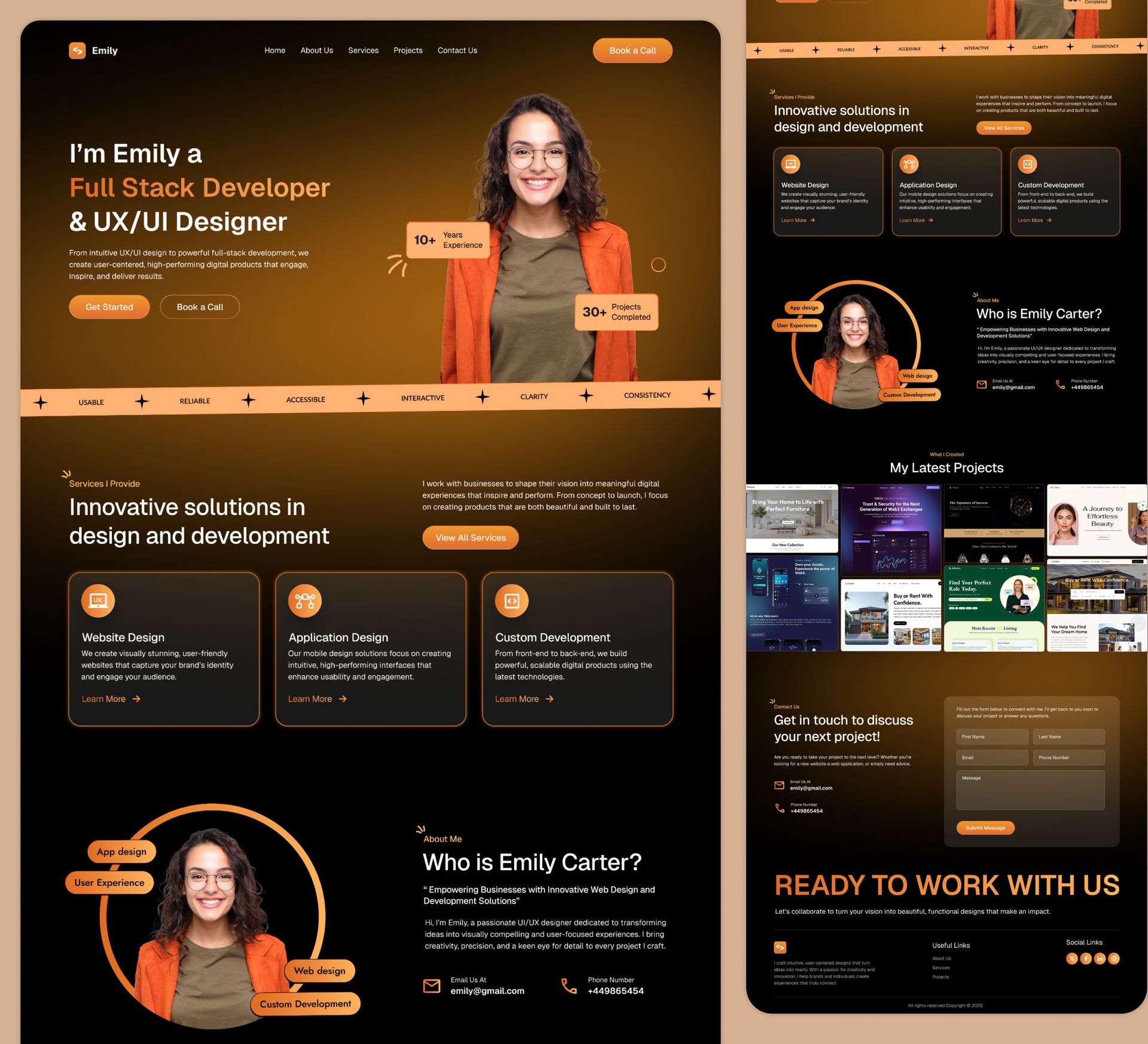
Tool Used: Unicorn Platform
Create a modern dark-theme personal portfolio for a Full Stack Developer named Joshua Nwaizu using neon blue accents and mobile-first design.
Hero Section:
Dark gradient background with soft blue bokeh. Centered intro: “Hello, I’m Joshua” in neon-blue gradient text. Subtitle: “Full Stack Developer.” Paragraph: “Crafting exceptional digital experiences with modern web technologies.” Two buttons: “View My Work” (solid blue) and “Get in Touch” (outline). Subtle ambient glow effect.

Skills Section:
Title “Skills & Expertise.” Short intro line: “Overview of my core technologies.”
3x3 icon grid for React, TypeScript, Next.js, Node.js, Tailwind, Express, Firebase, Docker, Git.
On hover: light scale and glow. Pure black background, blue divider line.

About Section:
Three stat blocks: “50+ Projects,” “3+ Years,” “100% Dedication.”
Profile card below: circular photo, name, title “Front-End Developer,” bio “Turning ideas into reality, one pixel at a time.”

Featured Projects:
Title “Featured Projects.” Text: “Recent work using modern web technologies.”
Example project card: “Analytics Dashboard” with image preview, short description, and “View Project” button.
Single column on mobile, two columns on desktop.

Contact Section:
Dark background with centered call to action: “Let’s build something exceptional together.”
Buttons: “Send Message” and “View Resume.”
Footer: © [Current Year] Joshua Nwaizu. Include social icons (GitHub, LinkedIn, Twitter) with blue hover glow.

Styling:
Font Inter or Poppins.
Colors: background #0A0B0E, text #FFFFFF, accent #4AB3FF.
Consistent glow effects and smooth scroll transitions.
Responsive for all devices.

Meta:
Title “Joshua Nwaizu | Full Stack Developer Portfolio.”
Description “Modern web developer creating elegant, high-performance digital experiences.”
Single-page structure with sticky top navigation.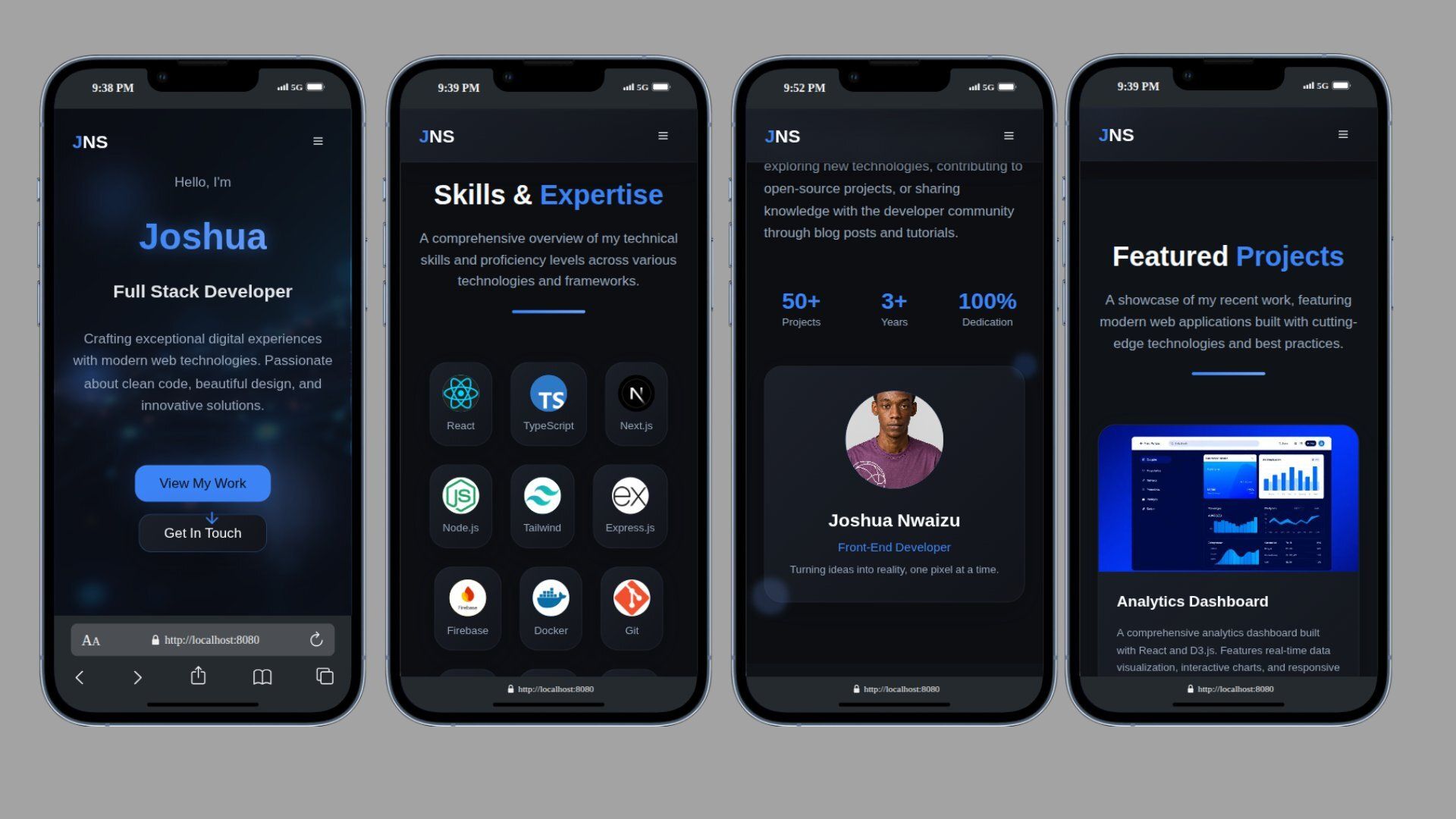
Tool Used: Adobe Express Portfolio Maker
Create a dark, cinematic personal portfolio for digital designer Leo Bennett using Adobe Express portfolio maker. Use black and bronze tones with bold white typography and orange accents. Hero section: full-width gradient from black to bronze, portrait spotlight, large centered text “LEO BENNETT” in all caps white, subtitle “I create interfaces that are both functional and visually striking.” Buttons: “View My Work” and “Download Resume” (orange with hover glow). Navigation bar: Home, Market, Features, Pricing, Support, right-aligned orange button “Download Resume,” logo top-left “PORTILPV.” Below hero, grayscale brand logos (Google, Afterpay, Asana, Dropbox, Spotify, Grammarly) in a horizontal row. About section: left badge “Creative & Talented Team ★★★★★”, right text “With a background in web and mobile design, I focus on functional, aesthetic interfaces built through research, strategy, and storytelling.” Stats: “100+ Projects” and “15yr Experience.” Featured Works: 4 cards (Mockups, App Design, Product Visualization, Logo Design) with dark backgrounds, white text, hover zoom. Services: 3 cards (Web Design, App Design, Branding & Visual Identity) with black-to-brown gradient and small icons; include a small profile image of Leo overlapping the section. Testimonials: title “Real Results, Real Clients,” three short client quotes with gray portraits and orange stars. Pricing: title “Choose Your Plan,” three cards (Basic, Standard, Premium) with white prices, orange “Get Started” buttons, and short descriptions. CTA: headline “Let’s Create Your New Brand,” short text inviting collaboration, orange “Start Your Project” button. Footer: black background, large gray “BENNETT” text, links (About, Services, Portfolio, Contact), white social icons (LinkedIn, Dribbble, Instagram) with orange hover. Style: font Montserrat or Space Grotesk, background #0B0B0C, text #FFFFFF, accent #FF7B2C, secondary bronze #9C6433. Use subtle motion fade-ins, consistent alignment, and mobile responsiveness. Meta title “Leo Bennett | Designer & Brand Architect,” description “Experienced digital designer crafting high-impact, story-driven visuals and interfaces.” Single-page structure optimized for Adobe Express export.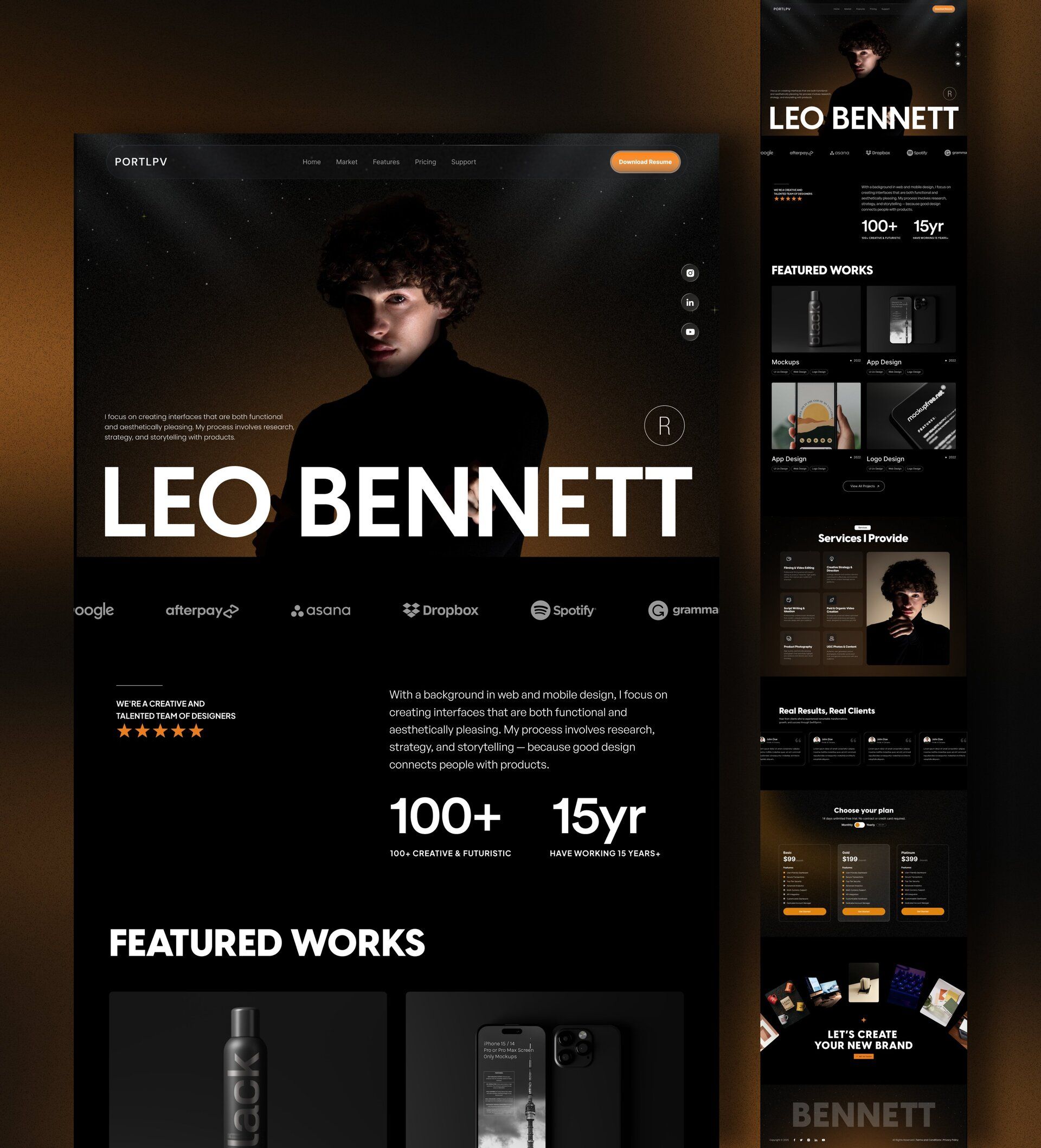
🛠️ Tutorial of the Week: Brief to wireframe in 5 minutes with Miro
Spending hours turning client briefs into wireframes is a waste of time. Use this workflow to get from PDF to prototype faster than you can say “can you make the logo bigger?”
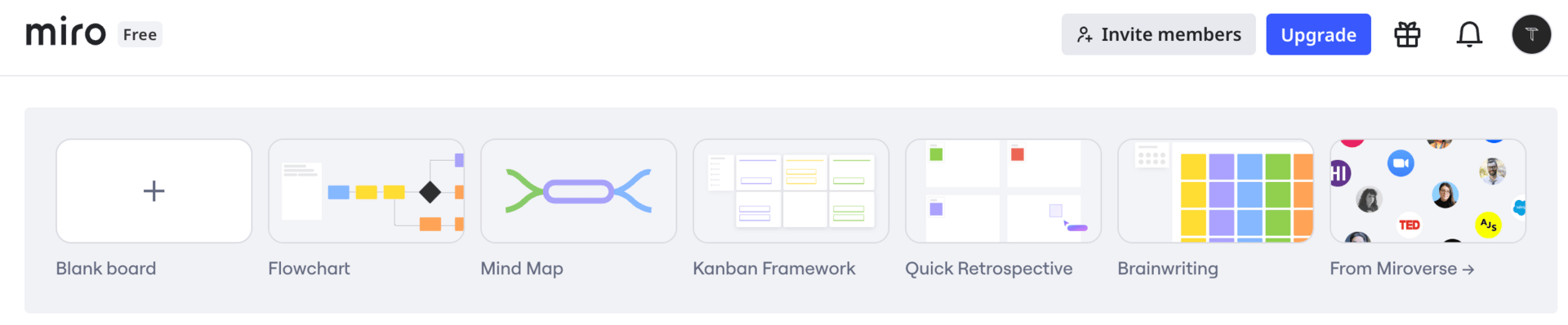
Step 1: Start Your Board
Open Miro and create a new board.
Upload your project brief PDF directly onto the canvas.
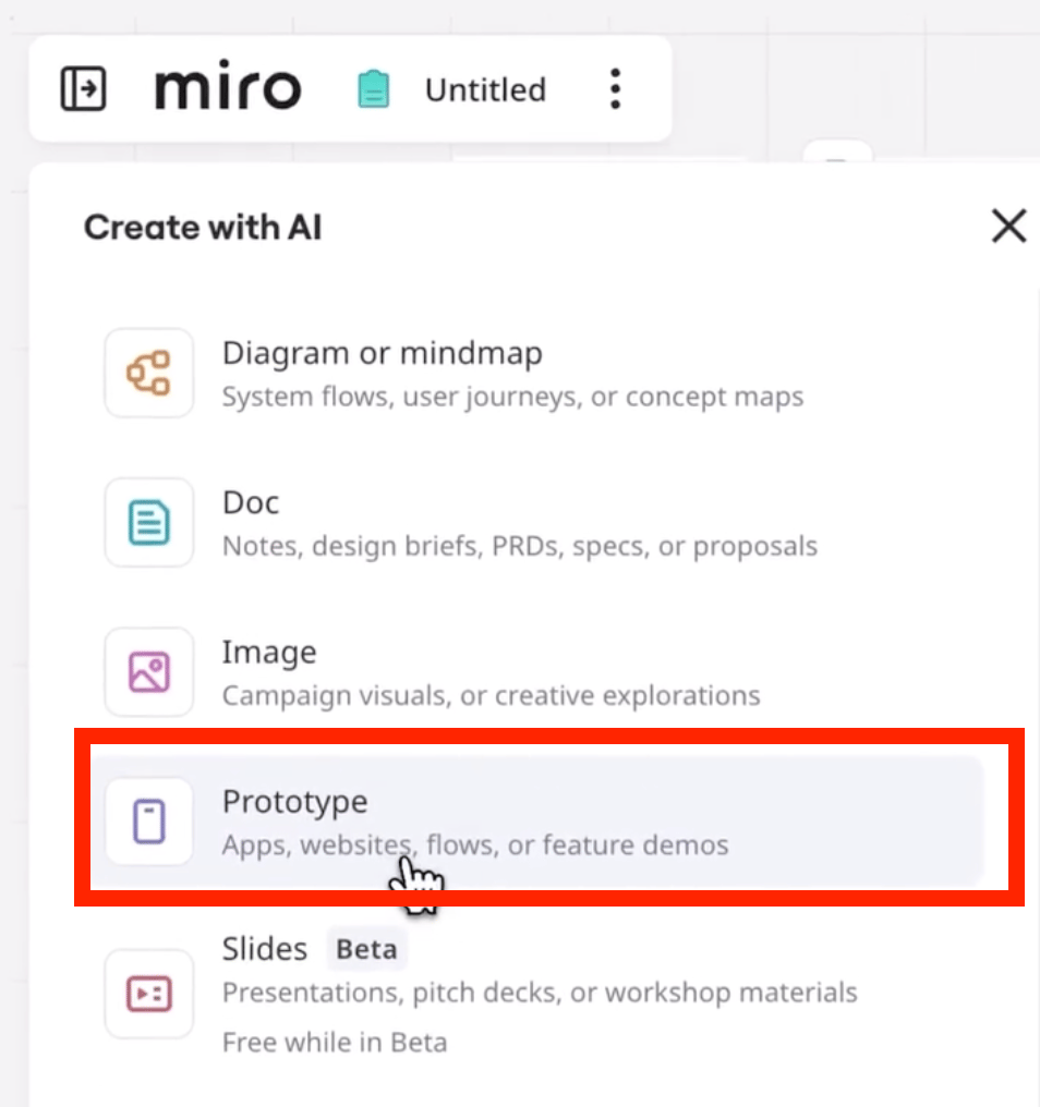
Select the PDF and click the Create with AI button.
Step 2: Generate Your Proposal
Navigate to the Doc panel on the left side.
Prompt the AI: "Create a full proposal with project scope, pricing, and timeline based on this brief."
Review the generated proposal. The AI will pull key details from your PDF and structure them into sections.
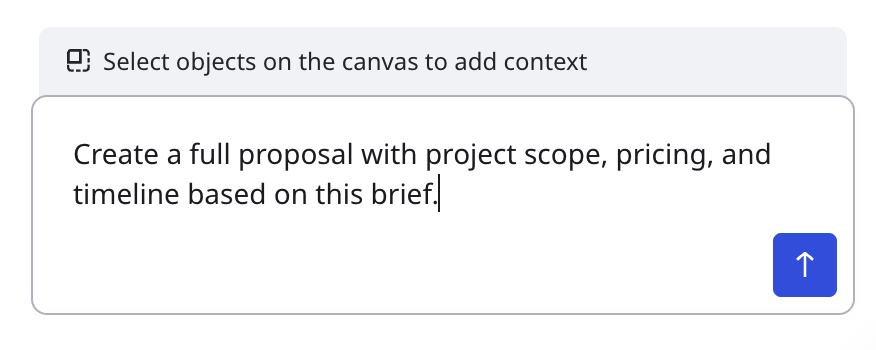
Pro Tip: Edit if needed. Miro's AI is smart, but you know your project better.
Step 3: Auto-Generate Your Site Map
After your client approves the proposal:
Use Miro's prototype tool (found in the Create with AI section).
Let the AI map out your site structure based on the information.
Make edits: drag, drop, and reorganize until it’s perfect.
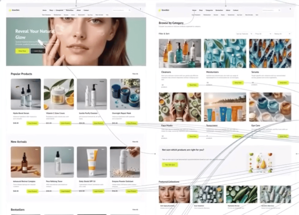
Step 4: Build Your Wireframe Prototype
Ask the AI to build your prototype directly from the sitemap.
Within seconds, Miro generates a working wireframe prototype with clickable interactions.
It’s not a static image, it's a fully functional prototype you can navigate and test.
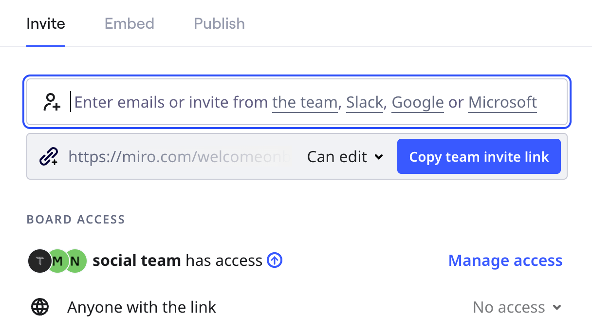
Step 5: Present Live to Your Client
Instead of messing around with files or screen recording:
Share your Miro board link directly
Walk through the prototype in real time while on call
Make live edits. No back and forth emails
What used to take hours back and forth happens in one focused session now. You can go from brief to wireframe, all without leaving Miro.
If you're tired of slow kickoffs, give it a shot.
💡 Prompt of the week: 3D Minimalist Retro Style
Graphic Tool Used: Midjourney
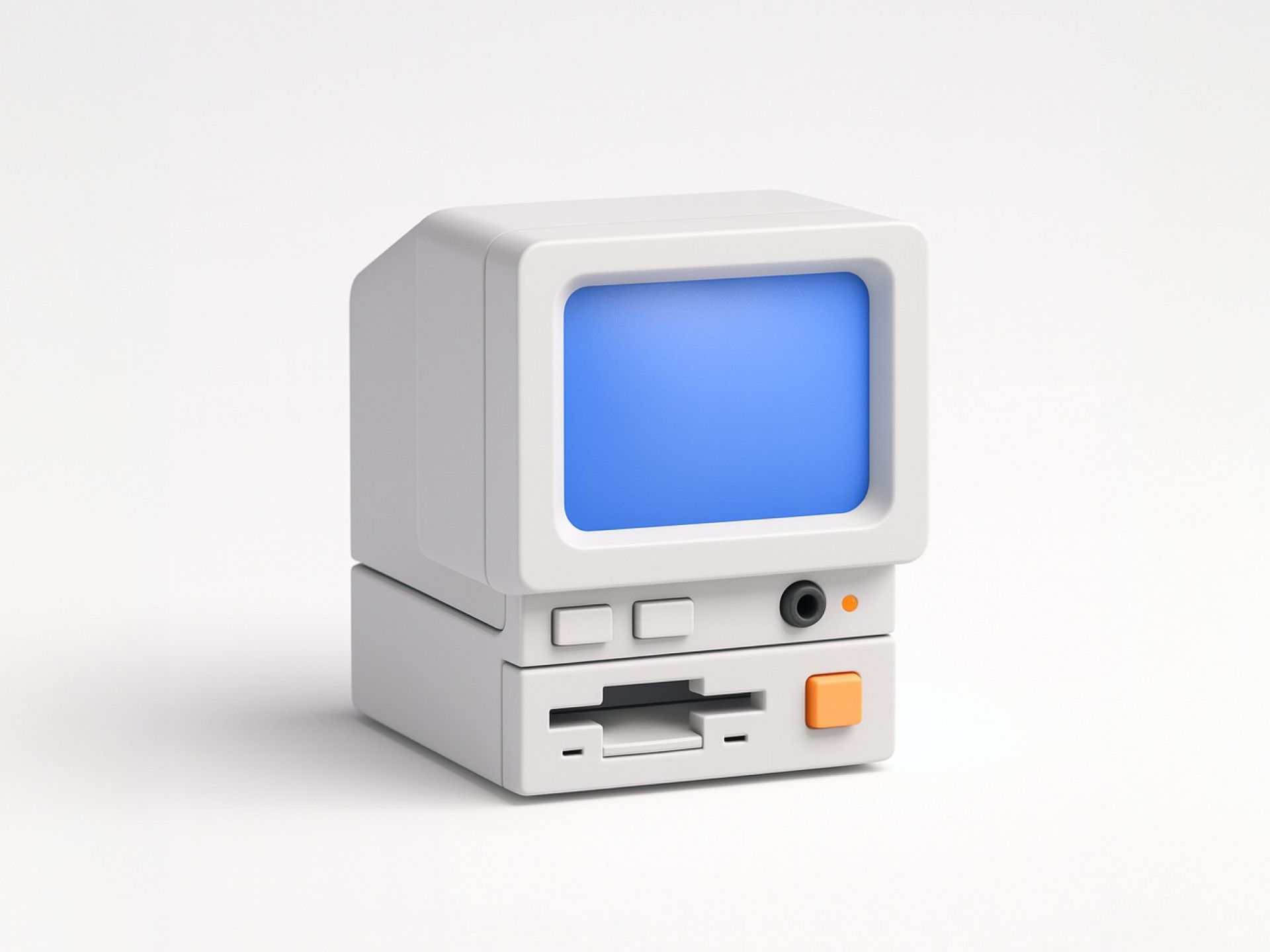
A small, minimalist 3D render of a retro desktop computer inspired by 1980s designs, featuring a compact CRT-style monitor with a soft glowing blue screen. The computer has a simple, geometric, toy-like form with smooth white plastic casing and rounded edges. Below the screen is a floppy disk slot, a few small buttons, and one orange accent button. The design is clean, modern, and symmetrical. The background is a plain, soft white or light gray studio backdrop with diffused lighting. The style is photorealistic yet stylized, evoking high-end product renders and Apple-like simplicity. No text, no logos, no cables. Rendered with soft global illumination, subtle reflections, and smooth shadow gradients.Wrapping Up
That’s it for this week, but I want to make each edition even better.
👉Got 30 seconds?
Fill out this quick survey and tell me what you'd love to see next. Your feedback directly shapes the next drop.
💌Know a designer who should be using AI smarter?
Forward them this email. Or just send them to logiaweb.com/weekly to join.
See you next Monday,
— Adrien

Adrien Ninet