- Logiaweb Weekly
- Posts
- The UI is the intelligence
The UI is the intelligence
Why AGI changes the job of a designer and how Meta’s making it real.
Adrien Ninet
July 07, 2025

Happy Monday, creative family, and welcome to Logiaweb Weekly.
This week’s design intelligence briefing reveals:
🧪 What I'm Building
🚨 Big News: Meta just went full AGI
🤖 Design Inspiration: Steal This App Design Flow
🛠️ Tutorial of the Week: Design an Entire Hero Section in Figma Using AI
💡 Prompt of the Week: AI Design w/ ChatGPT
🧪 What I'm Building
in the works…
This week, I refined my content creation systems and found a faster way to produce high-quality animated 3D icons. The kind that instantly elevates a brand.
I shared the full workflow in a YouTube tutorial, and it’s already gaining traction (watch it here if you’re interested).
While most of the week was dedicated to building content and growing my audience, next week the focus shifts back to the web design agency. We’ve signed several major clients recently, and now it’s time to deliver results.🚀
🚨Big News: Meta just went full AGI

What is AGI? And why it matters to you (yes, you)
AGI (Artificial General Intelligence) is AI that can think, learn, and solve problems like a human across any domain.
Not just writing tweets or debugging code. We're talking: reasoning, adapting, building.
So why should AI web designers care?
Because AGI isn't just changing how we build interfaces
It's becoming the user, the collaborator, and the product all at once.
Designers aren’t just shipping pixels anymore. You’re now shaping how AI thinks, acts, and interacts. The UI is the intelligence layer.
Scary? Kinda.
Exciting? One Hundred Percent.
Meta’s AGI Power Play
Big shakeup over at Meta. Zuck isn’t just playing in the sandbox anymore he’s building the whole playground.
He’s spun up a brand-new division: Meta Superintelligence Labs.
Think Avengers but for AGI.
Alexandr Wang (ex-Scale AI) is in as Chief AI Officer
Nat Friedman (former GitHub CEO / OSS king) is leading product + applied research
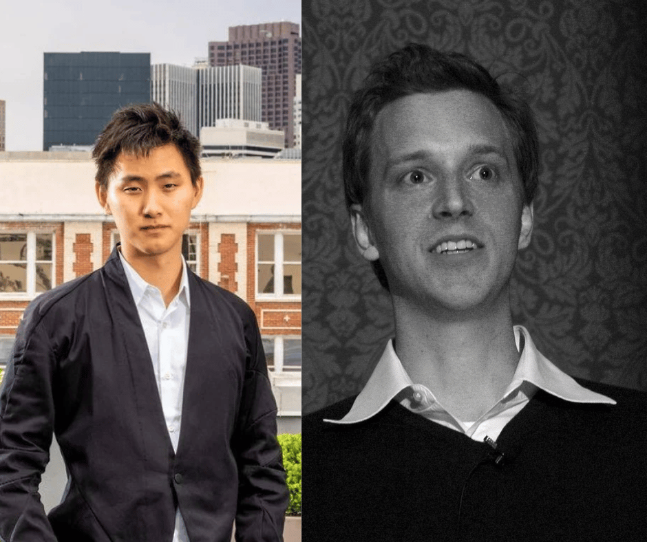
Alexandr Wang on left | Nat Friedman on right
Together they’re assembling what insiders are calling the “Fantastic 50”
50 elite researchers, poached straight from OpenAI, DeepMind, Anthropic, and Google.
Word on the street?
🫠 OpenAI says it feels like “someone broke into their house”
💸 Offers are hitting nine figures
Also: Meta didn’t just recruit Wang… they bought 49% of Scale AI for $14.3B.
Zuck’s vision? A “personal superintelligence” embedded into everything —
Instagram, WhatsApp, Quest headsets, even Ray-Bans.
You won’t just design for users anymore… you’ll be designing for AGI itself.
Why this matters (especially if you're building with AI)
This isn’t a research paper. It’s a billion-dollar bet on the future of human-computer interaction.
Meta’s going full nuclear on AGI while everyone else is still debating eval benchmarks.
Whether they pull it off or not? TBD.
But the talent exodus + centralization are already reshaping:
Open-source tooling
UI/UX design standards
How agents show up inside apps
And what an “AI-first” product even looks like
If you’re an AI designer and not - paying attention?
You’re not just missing trends you’re missing the meta game.
🤖 Design Inspiration: Steal This App Design Flow
see prompt #1 below
see prompt #2 below
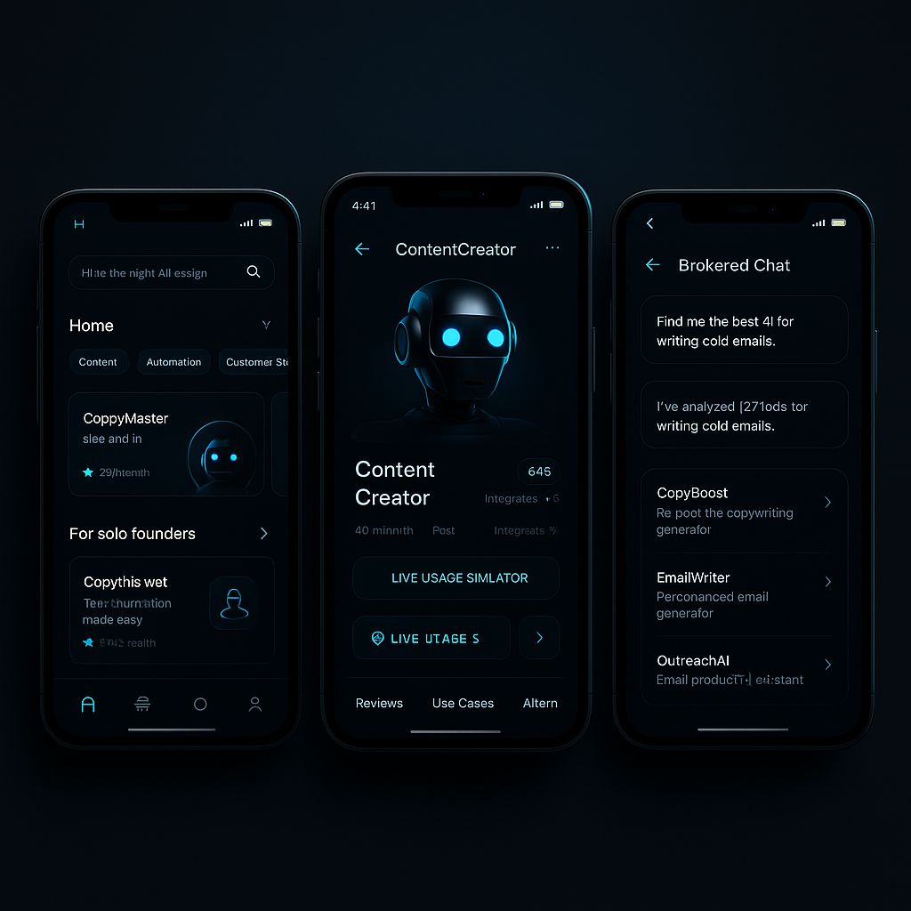
see promp #3 below
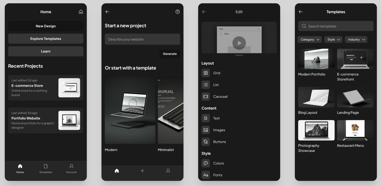
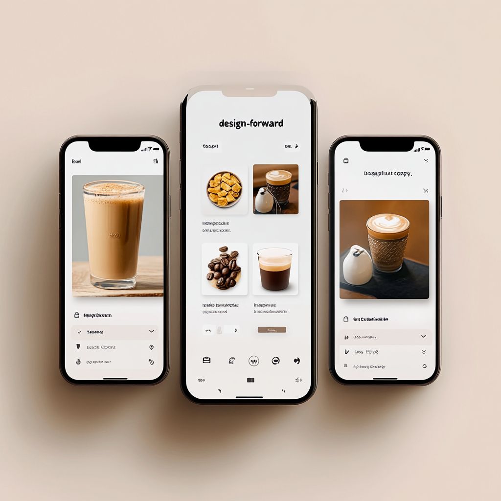
Tool Used: StitchDesign a mobile app for an AI web design agency. You're a senior product designer and UX strategist. I'm building a mobile app for an AI-powered web design agency that helps freelance designers, marketers, and founders quickly generate, edit, and manage website designs using AI prompts. It offers inspiration, swipe files, tutorials, and an AI-assisted layout builder. Your job is to refine the core idea by identifying the core value proposition and emotional hook, and defining who this is for and why it matters. Then, research the space by listing 3–5 comparable apps or tools (e.g., Framer, Uizard, Universe, Figma mobile, etc.), and extract common design patterns, layout structures, and tone of voice. Define the design system by specifying the visual style (typography, color palette, light/dark mode, UI components), suggesting a tone (e.g., futuristic yet friendly, clean but not cold), and pulling inspiration from leading design-forward tools. Break the app into 5–7 essential screens, and for each screen include the screen name, its purpose, key UI elements (like cards, prompts, buttons), layout recommendations (such as stacking, spacing, or swipe gestures), and the tone/style of any copy. Finally, generate a Stitch prompt in a markdown-style code block that includes the mobile app type, industry (AI + web design), number and purpose of screens, ideal visual style, theme, colors, fonts, tone, and any unique features (like swipe navigation or AI prompt input). Important: use a clean layout with space to breathe, clear information hierarchy, and an aesthetic that feels like Notion x Framer x Mimo with a splash of JetBrains Mono energy. Lastly, make it 3D black and white.Tool Used: MidjourneyPrompt: Design a mobile app for a modern coffee company. You're a senior product designer and UX strategist. I'm building a mobile app for a coffee brand that helps customers discover products, order drinks, explore brewing tips, and engage with the brand’s story and community. It should blend great UX with strong brand identity — simple, clean, and tactile. Your job is to refine the core idea by identifying the app’s key value proposition and emotional hook, and defining the target audience and why they’ll love it. Then, research the space by listing 3–5 comparable apps (e.g., Starbucks, Blue Bottle, Trade Coffee, etc.), and extract their common design patterns, layout structure, and tone of voice. Define the ideal design system: specify the visual style (warm browns, soft whites, light shadows, and a minimalist 3D look), clean sans-serif typography, soft shadows, rounded edges, and subtle microinteractions. Suggest a tone that’s calm, inviting, and artisanal — think “design-forward but cozy.” Break the app into 5–7 essential screens and, for each screen, include: name, purpose, main UI elements (cards, buttons, sliders, product previews, etc.), layout suggestions (swipe actions, tab navigation, scroll depth), and voice/tone for copy. Finally, generate a Stitch-ready prompt inside a markdown-style code block that includes: the app type (mobile), industry (coffee/e-commerce), number and purpose of screens, ideal design style (white + brown, minimalist, with 3D graphics), fonts, tone, and any special features like swipe-to-order or personalized brew recommendations. Important: ensure the design breathes — use negative space, intuitive navigation, and a layout that feels warm, crafted, and premium.Tool Used: ChatGPTPrompt #3: Design a mobile app for an AI-powered brokerage platform that helps entrepreneurs, creators, and agency owners discover, evaluate, and hire AI tools or services with confidence. Think of it as a digital broker connecting humans with high-performing AI—curated, intelligent, and tailored to each user’s needs based on use-case, price, output quality, and reviews. The experience should feel fast, sharp, and slightly futuristic, emphasizing minimal friction and maximum clarity. As a senior product designer and UX strategist, your role is to refine the core value proposition and emotional hook, define the ideal user (such as founders, freelancers, and operators), and explain what makes them return daily. Research 3–5 comparable platforms (e.g., Deel, AngelList, Product Hunt, Toptal, ElevenLabs) to extract winning design patterns, UX structures, and tones of voice that create trust and efficiency. Build a cold-tech design system using a dark blue and steel palette with neon accents, futuristic 3D icons (like robot heads and digital assistants), and a clean sans-serif typeface such as Inter or Space Grotesk. The interface should be card-based and modular, using glassmorphism, depth shadows, smooth transitions, and subtle microinteractions to convey a responsive, intelligent experience. The overall tone should be confident, direct, and high-leverage—communicating to founders, not casual users. Break the app into 5–7 essential screens, detailing for each: the screen name, purpose, core UI components (e.g., search bars, filters, cards, chat modules), layout logic (like swipe gestures or stacking), and copy tone. Finally, write a Stitch-ready prompt in markdown format that outlines the mobile app type, industry (AI services/tech marketplace), screen purposes, design style (3D, glassy, tech-forward with neon on blue), fonts, tone, and standout features like "Swipe to compare AIs," "Live usage simulator," and "Brokered AI chat window." The layout should balance sleekness and control—more like a next-gen dashboard than a basic app. Prioritize clarity, contrast, and a deep sense of interactivity.🛠️ Tutorial of the week: Design an Entire Hero Section in Figma Using AI (No Code Needed)
These are the exact prompts I used in my video “Generate Figma Designs with AI in Minutes (NEW Method)”.
If you're a designer, freelancer, or agency owner, use this to turn vague client requests into clean, modern mockups fast — even if you’re starting from a blank canvas.
Step 1: Install the Right Plugin
Tool Setup Prompt
Open Figma → Go to Plugins → Search and install HTML to Design plugin.
[see image below]
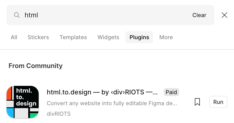
This plugin imports full websites or custom AI-generated HTML/CSS directly into Figma — fully editable.
Step 2: Connect AI to the Plugin
Use Claude AI (or Cursor AI) and connect it through the plugin's MCP (Model Control Panel).
Toggle the integration in the plugin settings.
Download Link: https://html.to.design/docs/mcp-tab#how-to-setup-for-claude-desktop
[see image below]
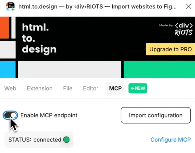
You’ll know it’s working when you see the green "Connected" status.
Step 3: Generate Your Hero Section with a Prompt
“Generate clean HTML and CSS for a modern, minimal hero section similar to Apple’s homepage. Include a centered headline, subtext, CTA button, and sleek gradient background.”
[see image below]
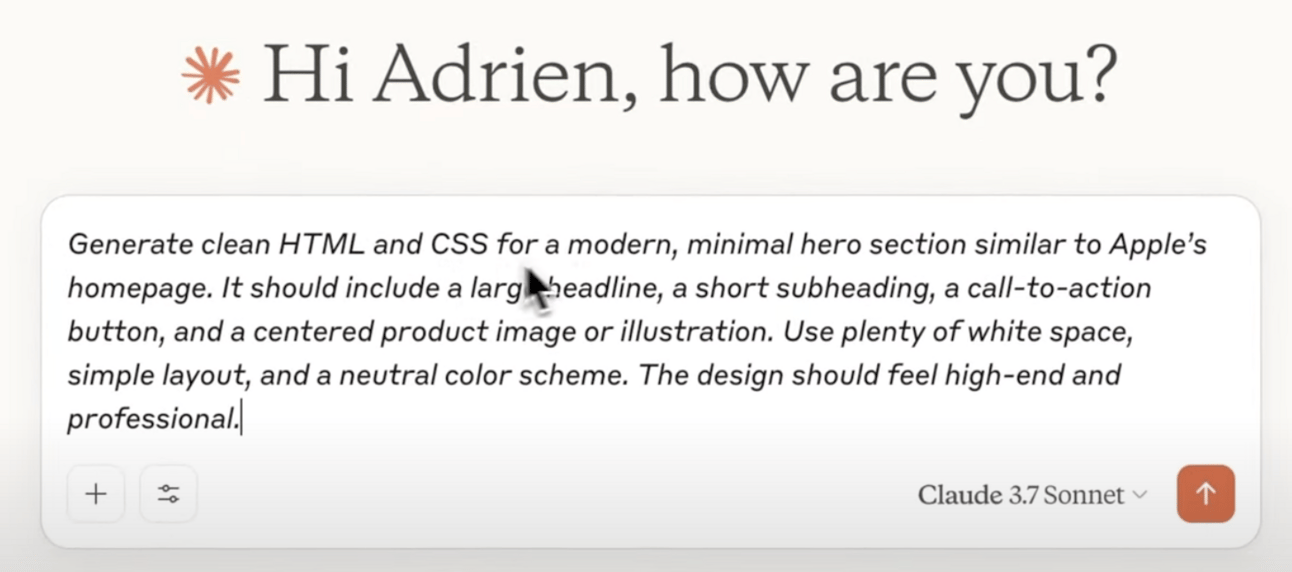
Watch Claude AI write the code in real time → then it’s pushed straight into your Figma file.
Step 4: Refine and Add Style
“Add creative elements to the hero section — include a background gradient, layered shapes, and a subtle motion effect suggestion.”
Use this to turn basic outputs into premium-feeling, client-ready design elements — no frontend dev needed.
Step 5: Customize the Layout in Figma
After it’s in Figma, customize the layout:
- Edit text, colors, and fonts
- Rearrange elements
- Finalize layout for desktop/mobile
[see final product below]
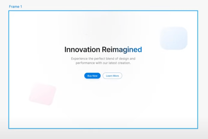
This method is perfect for prototyping quickly and presenting professional first drafts to clients without design burnout.
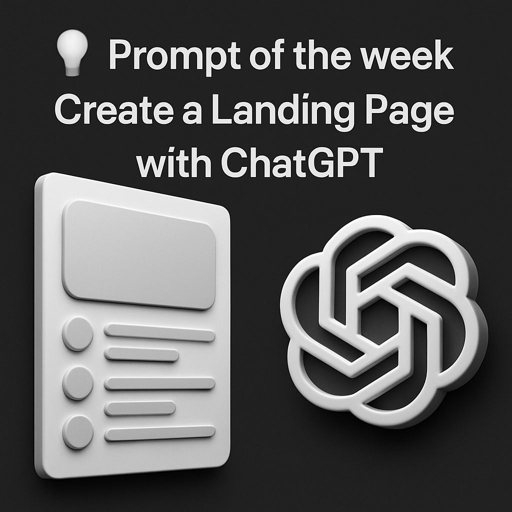
💡 Prompt of the week: AI Design w/ ChatGPT
Prompt: You are a senior product designer and direct-response copywriter for high-end tech startups.

I’m launching a landing page for an AI product called [insert product name], which helps [what the product does in one sentence].

I want a landing page that feels premium, minimal, and futuristic — like Linear, Anthropic, Vercel, or RunwayML.

Design the full layout and generate all of the copy, including the headlines, subheads, section titles, body copy, and CTA buttons.

🔲 Layout Structure:
Break the landing page into 6–8 scrollable sections. Include:

Hero (Headline, Subheadline, Primary CTA)

Product Benefit Stack (3–4 feature cards with icons)

How it Works (simple 3-step flow)

Use Cases (specific industries or roles who benefit)

Social Proof (logos, testimonials, or stats)

Pricing (if relevant)

Final CTA (restate value + one button to act)

🎨 Visual Direction:
Recommend visuals, layout spacing, and graphics ideas.
Use a black + white theme with neon accents (blue, green, or pink).

Include ideas for:

Where to place 3D elements (e.g., abstract shapes, cubes, AI brains, robot hands)

Suggestions for animated graphics or micro-interactions

Backgrounds (e.g., gradient haze, glassmorphism, subtle movement)

Suggest a font pairing and general typography scale (H1–H5, paragraph text).

✍️ Copywriting Style:

Write in short, punchy, benefit-driven copy

Use smart metaphors to explain complex AI functionality

Avoid buzzwords or fluff — everything must tie to user value

Every headline should be scroll-stopping (think Webflow, Notion, Midjourney)

Include at least two CTAs with button copy that is action-oriented, not generic

📦 Extras:
At the end, suggest:

A wireframe layout

Sections that can be turned into social media content

Bonus copy variations for A/B testing headlines or CTA text

Final output should be structured for use in Figma or Webflow.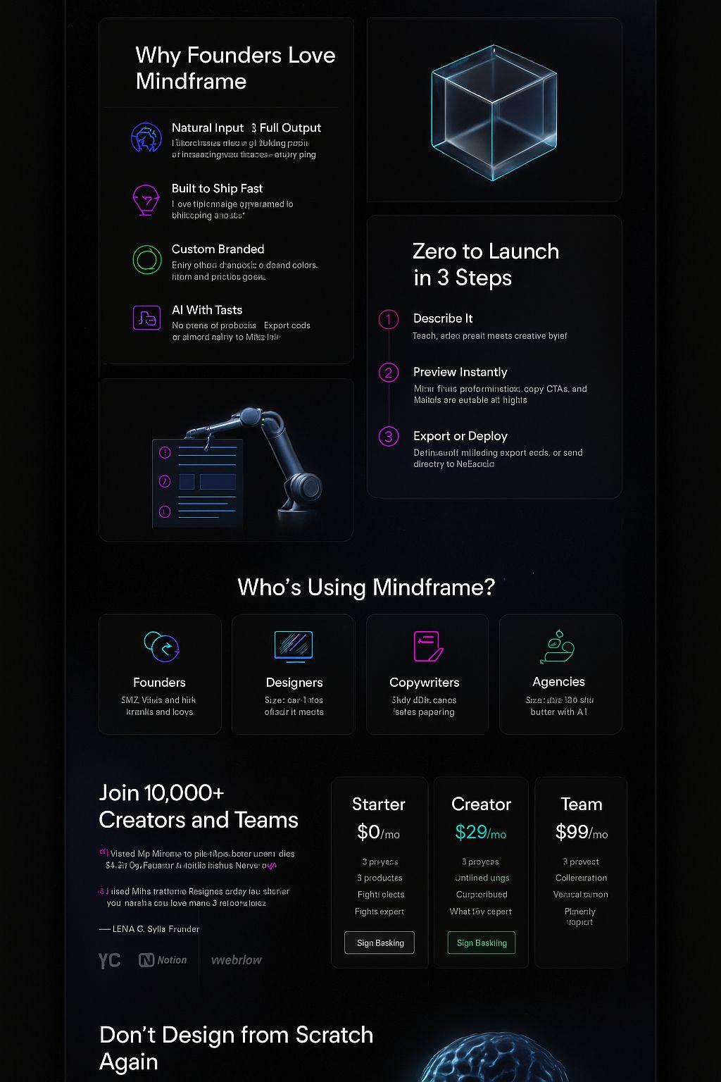
landing page generated with this prompt
That’s a wrap for today. Could you do me a 30 second favor?
👉 [Survey] – tell me what features you'd like most
Loved this issue? Forward to a peer or hit reply and say hi 😊
Catch you next Monday,
— Adrien